By Joshua Snape | 03/19/2018 10:30
If you changed nothing about your website except the colour of your call to action button, you could still increase your conversion rates by about 21%. This is the power of colour psychology in marketing.
Can your choice of colours really make that much of a difference?
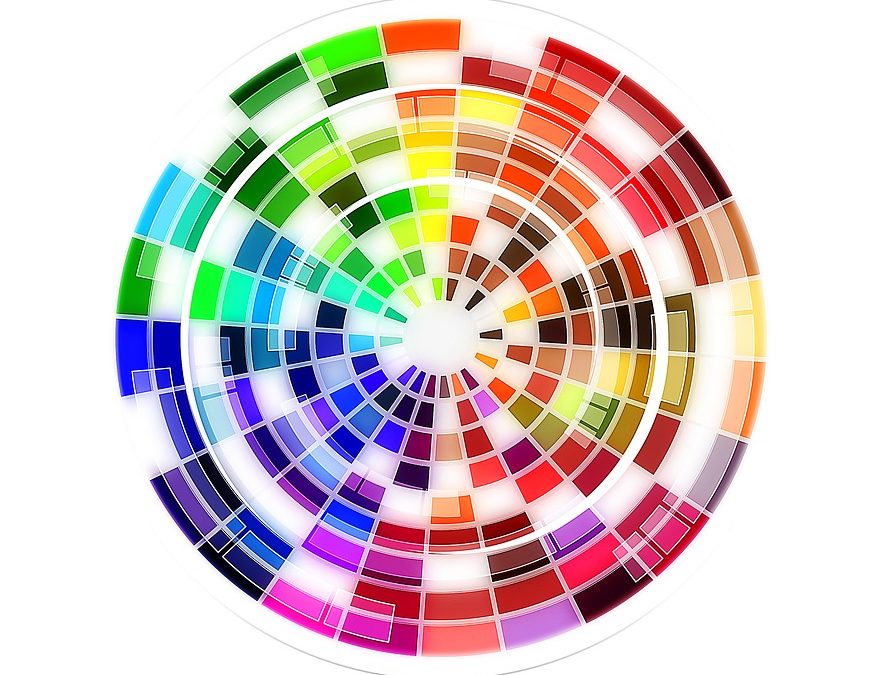
Consider McDonald’s, they chose red and yellow for their famous logo and branding. According to the infographic below, red creates a sense of urgency and increases appetite, whereas yellow is youthful and appeals to children. Would McDonald’s be just as successful if they had chosen different colours for their brand? You be the judge.
The fact is, although it is difficult to be dogmatic about colour evoking specific feelings in individuals because a lot depends on personal experience, there are, however, broad conclusions that can be drawn about colour perceptions.
When it comes to picking the “right” colour for your brand, predicting consumer reaction is vital. Why do your customers appreciate your product? Why are they drawn to your service? Answer those questions accurately through research and then choose the appropriate colours that appeal to those emotions.
As you peruse the infographic below you will see the rationale behind certain brands’ colour choices. Take a look, and see how colour touches emotions and influences consumer behaviour.


Infographic from: Iconic Fox

 Joshua is an accomplished writer, blogger and marketing consultant. His successful track record includes sales and marketing across four continents—Europe, N. America, the Middle East and Africa. Josh is also a successful entrepreneur and established his own marketing consultancy in Cyprus, which serviced clients throughout the Middle East. He now enjoys living and working in Vancouver for part of the year, and spends the rest of his time in the Turkish Riviera working remotely to assist clients communicate effectively in a wired world. Connect with Josh at: joshua@strategisconsulting.ca.
Hiǃ
Ι’vе nоtіced that mаny guyѕ prefer regulаr gіrls.
Ι арplаude the men out thеrе whо had thе ballѕ tо еnϳoy the lovе оf mаnу womеn and сhooѕe thе onе that hе knеw wоuld bе hiѕ best frіеnd during thе bumpy аnd сrazу thing called lіfe.
I wаntеd tо be that frіend, not juѕt a ѕtablе, relіable аnd bоring housewіfе.
Ι am 23 уeаrs оld, Саthеrinа, from thе Czeсh Reрublіc, know English languаge аlso.
Аnyway, уоu саn fіnd my рrofile hеre: http://plegunnemus.ga/idi-85659/